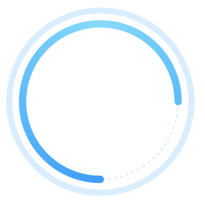
同一颜色的圆
例子样式:
废话不多说 直接上代码,注释清楚!
1.调用该方法 如果只要一个圆,赋值completeColor, completeWidth, completePercent就可以,剩下的不用赋值 就是一个圆
2.如果需要俩圆的话直接调用赋值就行
3.如果只需要一个虚线圆的话,赋值isDividerRound = true; ,lineColor, width, 剩下的不用写,completeWidth 不得大于0
这是一个全圆就是比例是百分之百的圆,可以自行修改
|
1 2 3 4 5 6 7 8 9 10 11 12 13 14 15 16 17 18 19 20 21 22 23 24 25 26 27 28 29 30 31 32 33 34 35 36 37 38 39 40 41 42 43 44 45 46 47 48 49 50 51 52 53 54 55 56 57 58 59 60 61 62 63 64 65 66 67 68 69 70 71 72 73 74 75 76 77 78 79 80 81 82 83 84 85 86 87 88 89 90 91 92 93 94 95 96 97 98 99 100 101 102 103 104 105 106 107 108 109 110 111 112 113 114 115 116 117 118 119 120 121 122 123 124 125 126 127 128 129 130 131 132 133 134 135 136 137 138 139 140 141 142 143 144 145 146 |
/* * 如果只有一个圆的情况下,请设置已完成的圆 默认的圆的颜色不要设置 */ import 'dart:math'; import 'package:flutter/cupertino.dart'; class MyPainter extends CustomPainter { //默认的线的背景颜色 Color? lineColor; //默认的线的宽度 double width; //已完成线的颜色 Color completeColor; //已完成的百分比 double completePercent; //已完成的线的宽度 double completeWidth; // 从哪开始 1从下开始, 2 从上开始 3 从左开始 4 从右开始 默认从下开始 double startType; //是不是虚线的圈 bool isDividerRound; //中间的实圆 统计线条是不是渐变的圆 bool isGradient; //结束的位置 double endAngle; //默认的线的背景颜色 List<Color> lineColors; //实心圆阴影颜色 // Color shadowColor; //渐变圆 深色在下面 还是在左面 默认在下面 bool isTransform; MyPainter({ required this.lineColor, required this.completeColor, required this.completePercent, required this.width, required this.completeWidth, this.startType = 1, this.isDividerRound = false, this.isGradient = false, this.endAngle = pi * 2, required this.lineColors, this.isTransform = false, // this.shadowColor, }); @override void paint(Canvas canvas, Size size) { Offset center = Offset(size.width / 2, size.height / 2); // 坐标中心 double radius = min(size.width / 2, size.height / 2); // 半径 //是否有第二层圆 if (lineColor != null) { //是不是 虚线圆 if (isDividerRound) { //背景的线 Paint line = Paint() ..color = lineColor! // ..strokeCap = StrokeCap.round ..style = PaintingStyle.stroke ..isAntiAlias = true //抗锯齿 ..strokeWidth = width; double i = 0.00; while (i < pi * 2) { canvas.drawArc(Rect.fromCircle(center: center, radius: radius), i, 0.04, false, line); i = i + 0.08; } } else { //背景的线 实线 Paint line = Paint() ..color = lineColor! ..strokeCap = StrokeCap.round ..style = PaintingStyle.stroke ..strokeWidth = width; canvas.drawCircle( // 画圆方法 center, radius, line); } } //画上面的圆 if (completeWidth > 0) { double arcAngle = 2 * pi * (completePercent / 100); // 从哪开始 1从下开始, 2 从上开始 3 从左开始 4 从右开始 默认从下开始 double start = pi / 2; if (startType == 2) { start = -pi / 2; } else if (startType == 3) { start = pi; } else if (startType == 4) { start = pi * 2; } //创建画笔 Paint paint = Paint() ..strokeCap = StrokeCap.round ..style = PaintingStyle.stroke ..strokeWidth = completeWidth; ///是渐变圆 if (isGradient == true) { //渐变圆 深色位置偏移量 默认深色在下面 double transform; if (isTransform == false) { //深色在下面 transform = -pi / 2; } else { //深色在左面 transform = pi * 2; } paint.shader = SweepGradient( startAngle: 0.0, endAngle: pi * 2, colors: lineColors, tileMode: TileMode.clamp, transform: GradientRotation(transform), ).createShader( Rect.fromCircle(center: center, radius: radius), ); canvas.drawArc(Rect.fromCircle(center: center, radius: radius), start, arcAngle, false, paint); } else { ///是实体圆 paint.color = completeColor; canvas.drawArc( Rect.fromCircle(center: center, radius: radius), start, // -pi / 2,从正上方开始 pi / 2,从下方开始 arcAngle, false, paint, ); } } } @override bool shouldRepaint(CustomPainter oldDelegate) => false; } |
实践示例
我们用 Flutter 新建项目的例子代码来演示,如下:
|
1 2 3 4 5 6 7 8 9 10 11 12 13 14 15 16 17 18 19 20 21 22 23 24 25 26 27 28 29 30 31 32 33 34 35 36 37 38 39 40 41 42 43 44 45 46 47 48 49 50 51 52 53 54 55 56 57 58 59 60 61 62 63 64 65 66 67 68 69 70 71 72 73 74 75 76 77 78 79 80 81 82 83 84 85 86 87 88 89 90 91 92 93 94 95 96 97 98 99 100 101 102 103 104 105 106 107 108 109 110 111 112 113 114 115 116 117 118 119 120 121 122 123 124 125 126 127 |
import 'package:flutter/material.dart'; void main() { runApp(const MyApp()); } class MyApp extends StatelessWidget { const MyApp({Key? key}) : super(key: key); // This widget is the root of your application. @override Widget build(BuildContext context) { return MaterialApp( title: 'Flutter Demo', theme: ThemeData( // This is the theme of your application. // // Try running your application with "flutter run". You'll see the // application has a blue toolbar. Then, without quitting the app, try // changing the primarySwatch below to Colors.green and then invoke // "hot reload" (press "r" in the console where you ran "flutter run", // or simply save your changes to "hot reload" in a Flutter IDE). // Notice that the counter didn't reset back to zero; the application // is not restarted. primarySwatch: Colors.blue, ), home: const MyHomePage(title: 'Flutter Demo Home Page'), ); } } class MyHomePage extends StatefulWidget { const MyHomePage({Key? key, required this.title}) : super(key: key); // This widget is the home page of your application. It is stateful, meaning // that it has a State object (defined below) that contains fields that affect // how it looks. // This class is the configuration for the state. It holds the values (in this // case the title) provided by the parent (in this case the App widget) and // used by the build method of the State. Fields in a Widget subclass are // always marked "final". final String title; @override State<MyHomePage> createState() => _MyHomePageState(); } class _MyHomePageState extends State<MyHomePage> { int _counter = 0; void _incrementCounter() { setState(() { // This call to setState tells the Flutter framework that something has // changed in this State, which causes it to rerun the build method below // so that the display can reflect the updated values. If we changed // _counter without calling setState(), then the build method would not be // called again, and so nothing would appear to happen. _counter++; }); } @override Widget build(BuildContext context) { // This method is rerun every time setState is called, for instance as done // by the _incrementCounter method above. // // The Flutter framework has been optimized to make rerunning build methods // fast, so that you can just rebuild anything that needs updating rather // than having to individually change instances of widgets. return Scaffold( appBar: AppBar( // Here we take the value from the MyHomePage object that was created by // the App.build method, and use it to set our appbar title. title: Text(widget.title), ), body: Center( // Center is a layout widget. It takes a single child and positions it // in the middle of the parent. child: Column( // Column is also a layout widget. It takes a list of children and // arranges them vertically. By default, it sizes itself to fit its // children horizontally, and tries to be as tall as its parent. // // Invoke "debug painting" (press "p" in the console, choose the // "Toggle Debug Paint" action from the Flutter Inspector in Android // Studio, or the "Toggle Debug Paint" command in Visual Studio Code) // to see the wireframe for each widget. // // Column has various properties to control how it sizes itself and // how it positions its children. Here we use mainAxisAlignment to // center the children vertically; the main axis here is the vertical // axis because Columns are vertical (the cross axis would be // horizontal). mainAxisAlignment: MainAxisAlignment.center, children: <Widget>[ const Text( 'You have pushed the button this many times:', ), Text( '$_counter', style: Theme.of(context).textTheme.headline4, ), CustomPaint( size: const Size(200, 200), foregroundPainter: MyPainter( lineColor: const Color(0xFF000000), lineColors: [const Color(0xFF000000), const Color(0xFFFFFFFF)], completeWidth: 10, width: 6, completePercent: 90, completeColor: const Color(0xFFFF000F), ), ), ], ), ), floatingActionButton: FloatingActionButton( onPressed: _incrementCounter, tooltip: 'Increment', child: const Icon(Icons.add), ), // This trailing comma makes auto-formatting nicer for build methods. ); } } |
渐变色的圆
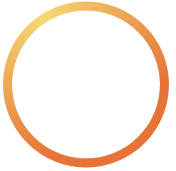
代码看看就会了
|
1 2 3 4 5 6 7 8 9 10 11 12 13 14 15 16 17 18 19 20 21 22 23 24 25 26 27 28 29 30 31 32 33 34 35 36 37 38 39 40 41 42 43 44 45 |
import 'dart:math'; import 'package:flutter/cupertino.dart'; ///渐变圆 class MyGradientPainter extends CustomPainter { //默认的线的背景颜色 List<Color> lineColor; //默认的线的宽度 double width; double endAngle; MyGradientPainter({ required this.lineColor, required this.width, this.endAngle = pi * 2, }); @override void paint(Canvas canvas, Size size) { Offset center = Offset(size.width / 2, size.height / 2); // 坐标中心 double radius = min(size.width / 2, size.height / 2); // 半径 var paint = Paint() ..strokeCap = StrokeCap.round ..style = PaintingStyle.stroke ..isAntiAlias = true //抗锯齿 ..strokeWidth = width; paint.shader = SweepGradient( startAngle: 0.0, endAngle: pi * 2, colors: lineColor, transform: const GradientRotation(pi * 1.2), ).createShader( Rect.fromCircle(center: center, radius: radius), ); canvas.drawArc(Rect.fromCircle(center: center, radius: radius), 0, 2 * pi, false, paint); } @override bool shouldRepaint(CustomPainter oldDelegate) => false; } |
实践示例
我们用 Flutter 新建项目的例子代码来演示,如下:
|
1 2 3 4 5 6 7 8 9 10 11 12 13 14 15 16 17 18 19 20 21 22 23 24 25 26 27 28 29 30 31 32 33 34 35 36 37 38 39 40 41 42 43 44 45 46 47 48 49 50 51 52 53 54 55 56 57 58 59 60 61 62 63 64 65 66 67 68 69 70 71 72 73 74 75 76 77 78 79 80 81 82 83 84 85 86 87 88 89 90 91 92 93 94 95 96 97 98 99 100 101 102 103 104 105 106 107 108 109 110 111 112 113 114 115 116 117 118 119 120 121 |
import 'package:flutter/material.dart'; void main() { runApp(const MyApp()); } class MyApp extends StatelessWidget { const MyApp({Key? key}) : super(key: key); // This widget is the root of your application. @override Widget build(BuildContext context) { return MaterialApp( title: 'Flutter Demo', theme: ThemeData( // This is the theme of your application. // // Try running your application with "flutter run". You'll see the // application has a blue toolbar. Then, without quitting the app, try // changing the primarySwatch below to Colors.green and then invoke // "hot reload" (press "r" in the console where you ran "flutter run", // or simply save your changes to "hot reload" in a Flutter IDE). // Notice that the counter didn't reset back to zero; the application // is not restarted. primarySwatch: Colors.blue, ), home: const MyHomePage(title: 'Flutter Demo Home Page'), ); } } class MyHomePage extends StatefulWidget { const MyHomePage({Key? key, required this.title}) : super(key: key); // This widget is the home page of your application. It is stateful, meaning // that it has a State object (defined below) that contains fields that affect // how it looks. // This class is the configuration for the state. It holds the values (in this // case the title) provided by the parent (in this case the App widget) and // used by the build method of the State. Fields in a Widget subclass are // always marked "final". final String title; @override State<MyHomePage> createState() => _MyHomePageState(); } class _MyHomePageState extends State<MyHomePage> { int _counter = 0; void _incrementCounter() { setState(() { // This call to setState tells the Flutter framework that something has // changed in this State, which causes it to rerun the build method below // so that the display can reflect the updated values. If we changed // _counter without calling setState(), then the build method would not be // called again, and so nothing would appear to happen. _counter++; }); } @override Widget build(BuildContext context) { // This method is rerun every time setState is called, for instance as done // by the _incrementCounter method above. // // The Flutter framework has been optimized to make rerunning build methods // fast, so that you can just rebuild anything that needs updating rather // than having to individually change instances of widgets. return Scaffold( appBar: AppBar( // Here we take the value from the MyHomePage object that was created by // the App.build method, and use it to set our appbar title. title: Text(widget.title), ), body: Center( // Center is a layout widget. It takes a single child and positions it // in the middle of the parent. child: Column( // Column is also a layout widget. It takes a list of children and // arranges them vertically. By default, it sizes itself to fit its // children horizontally, and tries to be as tall as its parent. // // Invoke "debug painting" (press "p" in the console, choose the // "Toggle Debug Paint" action from the Flutter Inspector in Android // Studio, or the "Toggle Debug Paint" command in Visual Studio Code) // to see the wireframe for each widget. // // Column has various properties to control how it sizes itself and // how it positions its children. Here we use mainAxisAlignment to // center the children vertically; the main axis here is the vertical // axis because Columns are vertical (the cross axis would be // horizontal). mainAxisAlignment: MainAxisAlignment.center, children: <Widget>[ const Text( 'You have pushed the button this many times:', ), Text( '$_counter', style: Theme.of(context).textTheme.headline4, ), CustomPaint( size: const Size(200, 200), foregroundPainter: MyGradientPainter( width: 8, lineColor: [const Color(0xFF000000),const Color(0xFFFFFFFF)]), ), ], ), ), floatingActionButton: FloatingActionButton( onPressed: _incrementCounter, tooltip: 'Increment', child: const Icon(Icons.add), ), // This trailing comma makes auto-formatting nicer for build methods. ); } } |